Selected work · Client redesign in progress
A stronger stage for Kent’s urban music.
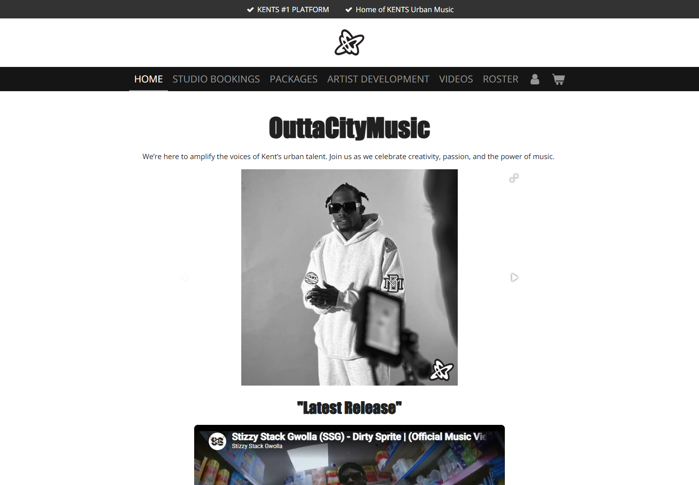
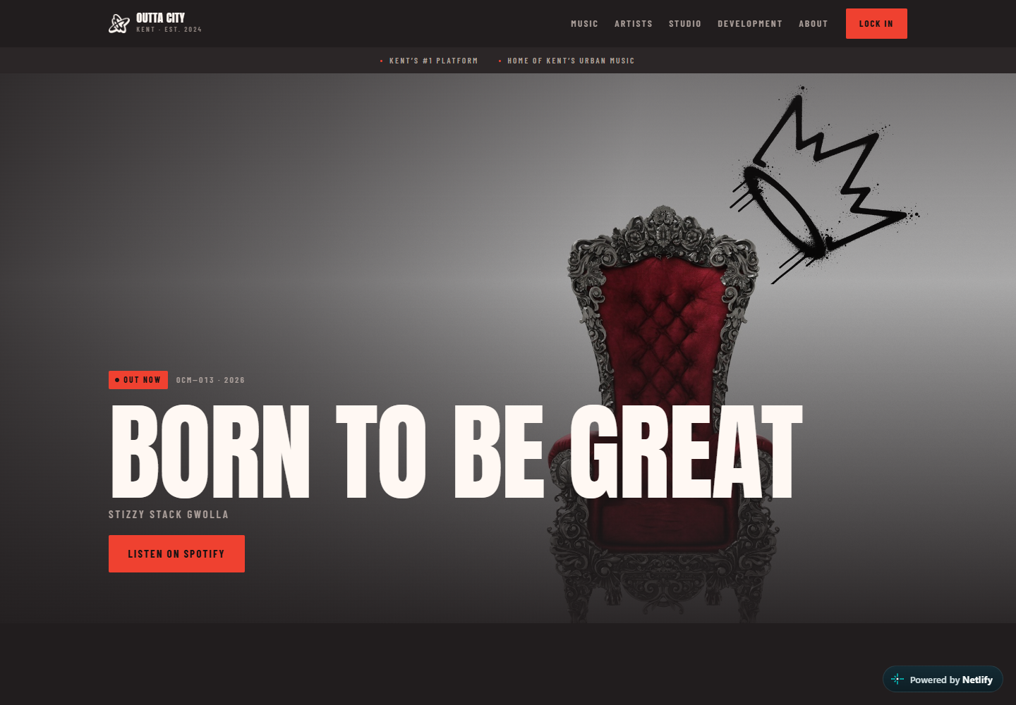
Keep the identity. Improve the journey.
The opportunity
Give a growing music company a more confident digital presence without pretending it needed a new identity. Visitors should understand the world of the brand, then find artists, studio services and bookings without digging.
The response
A darker, performance-led visual system; stronger typography and imagery; clearer service routes; and a more deliberate journey from first impression to listening, booking or making contact.
01
Immediate character
The opening view now feels closer to the energy and ambition of the company.
02
Clearer routes
Artists, studio services and booking actions are promoted as distinct reasons to visit.
03
Room to grow
The structure can expand as new artists, releases, sessions and events are added.
A transparent work-in-progress.
The Outta City Music name, identity, music and supplied brand materials belong to the client. Some preview content is still being replaced and approved, so the redesign preview should be read as an active project rather than the client’s finished official website.
Does an existing website need a stronger next version?
Show us what you have, what needs to change and what visitors should do next.